Alyson Lam
Undergraduate
I am a child of self-made Vietnamese immigrants who have given me this opportunity to do what I love.
When I think back to my childhood, I see my much younger self sitting beside my mother in her nail salon. As a four year-old girl it was amazing to see, what seemed like, every color imaginable sitting on those walls. Each one in their own little bottle waiting to be paired with the right person. So I would always talk to all the customers, asking them about themselves and trying to figure out what brought them in. It was so exciting to find those perfect matches.
In the past three years, I have still been asking people those questions, trying to figure out their needs, but in situations beyond picking a nail polish. As a designer, I have discovered and practiced the idea of human-centered design through various studio projects where I aim to balance practicality with usability.
My interests and strengths lie in user research, but in my journey as a designer I've developed my skills in sketching, UI prototyping, and graphic design.
With each project, I aim to learn more about the tools necessary to solving the problems of the human condition.
48 Hour Repack Competition
Team Members:
KC Westbrook, Madison Watts
Solo Project:
48 Hour Repack Competition
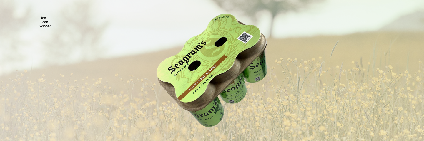
Plastic waste has become ubiquitous in our everyday lives. For the 48 Hour Repack Competition, hosted by the Southeastern chapter of IoPP, students around the country were challenged to redesign the Hi-Cone six-pack plastic ring carrier. The goal was to make a carrier that could be easily recycled within the continental U.S. while maintaining a similarly low weight. In solving this issue, our group considered the linear lifecycle of these kinds of plastic products. They go from raw material, production, use, and then finally disposal. While programs exist to recycle these carriers, consumers are not aware of them. We felt that the root of this issue came from the material itself.
The process of redesigning this began at sketches and research. We looked to work of previous winners and found many flat pack paper solutions. At this step, I considered the form of fiber drink carriers similar to ones at Starbucks or McDonalds. These drink carriers support cups from the bottom, but simply flipping the carrier around sparked the final concept.
Fiber drink carriers are made using a process called thermoforming. This results in products with plastic-like strength and finished in complex geometries, but still made of a renewable materials such as wood pulp or recycled materials. The manufacturing of these products can be done with zero water waste and with easily replenished materials that can then be recycled post-use, leading to a circular life.
The final design features a fiber holder that grips the lip of the cans and a recycled paperboard label to display brand-specific graphics and a QR code to help consumers properly dispose of the carrier.
Soteria
Group Members: Tammy Hsu, Mary Alsayar, Tymirra Smith
Class: Summer Vertical Studio
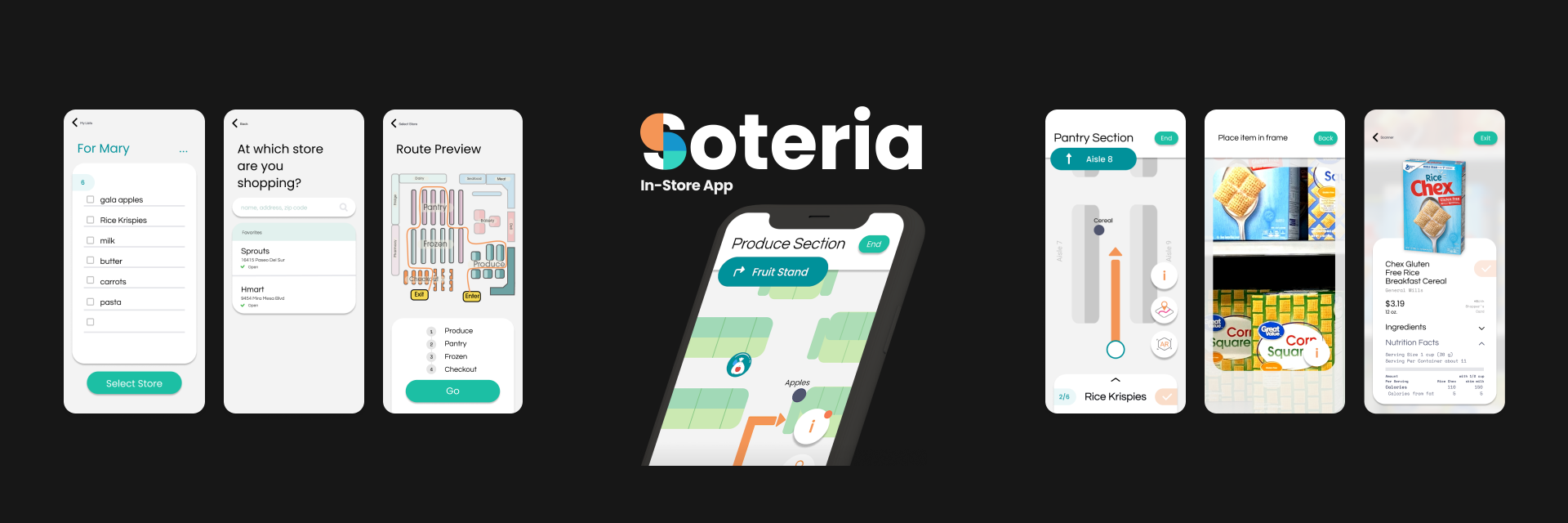
Soteria: In-store App
Soteria is a system of products to help you navigate grocery shopping during the COVID-19 pandemic. At the beginning of the pandemic, the grocery store was the only place people had to frequent. Despite this, 35% of people felt that grocery stores were not doing enough to help protect against COVID-19.
Soteria consists of a shopping cart that alerts you when other are standing within 6 feet, hand sanitizing kiosks, a produce bag dispenser triggered by receiving hand sanitizer, and self-checkout stations that begin after the user has sanitized their hands.
These physical components are then connected via an app that navigates the user along the most efficient shopping route based on their grocery list. By doing this, less time is spent physically inside the grocery store, thus reducing potential exposure to COVID-19. The app is intended to be used prior to entering a store and while shopping. After selecting a specific location to visit, the user's list is used to generate an efficient shopping route through the store. As the user shops, the list can be updated and regenerated to account for any new items. To further limit the need to touch objects throughout the store, the app uses image recognition to look up information about items.
This project was my first full project on Figma from ideation to full interactive prototyping. I learned a lot about developing a workflow through an app and creating components to make collaboration more efficient.
Allo
Class: ID 3824 | Instructor: John White
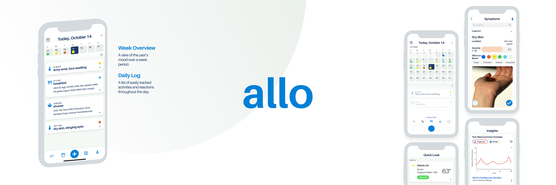
Allo: Allergy Tracking
Allo is a health tracking app to help a user's manage their allergies. Allergies can develop anytime throughout life, but finding the specific allergen can be confusing and difficult. By keeping a daily log of various symptoms and products used, one can begin to narrow down the possible causes of reactions. Allo brings awareness to possible allergens and how a user is being exposed to it. A user can also explore their reactions alongside exposure in the insight tab.
Assigning a mood for each symptom allows the user to get a quick understanding of their mental state to better visualize the effect an allergen may have. Along with a severity level and mood level, symptoms can be tagged with adjectives to be sorted later.
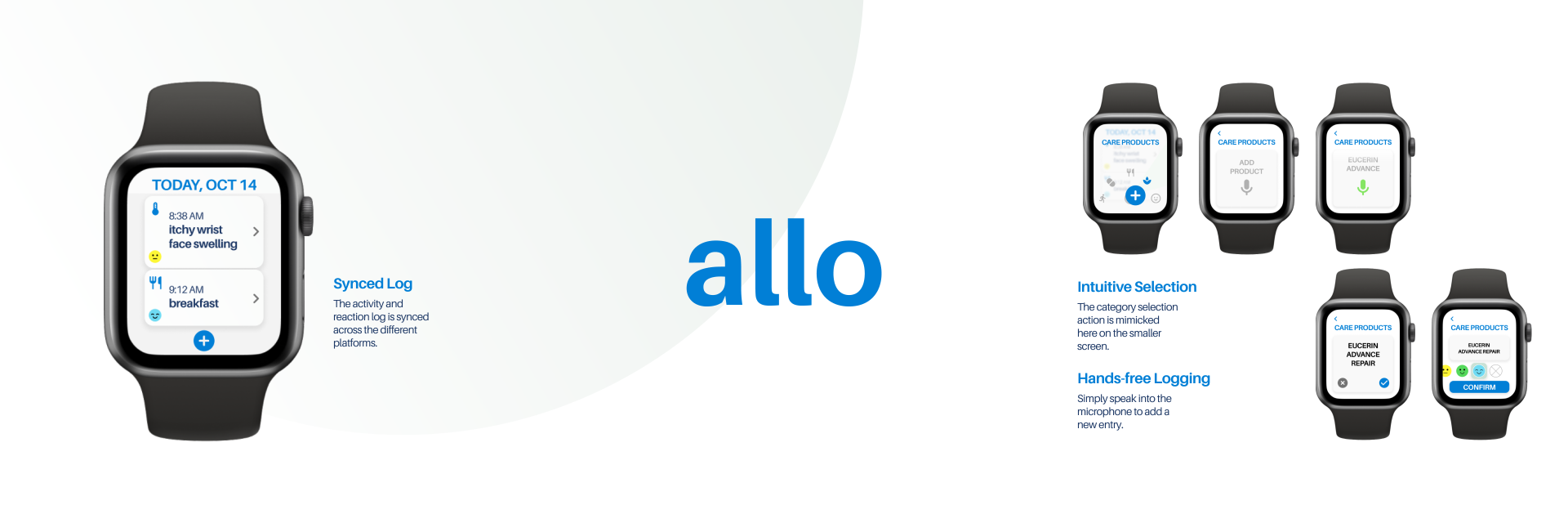
Allo Apple Watch
Allo: Allergy Tracking
This is Allo for the Apple Watch. The user's health log is synced from the phone and can be accessed or updated from anywhere. This is especially useful when encountering a new reaction. Allo's interface on the watch intends to provide the same intuitive experience and level of insight into a user's allergies and health as on the phone. Using the watch's built-in microphone and text-to-speech, entries can be made easily.
(Re)collection
Class: ID 3824 | Instructor: John White
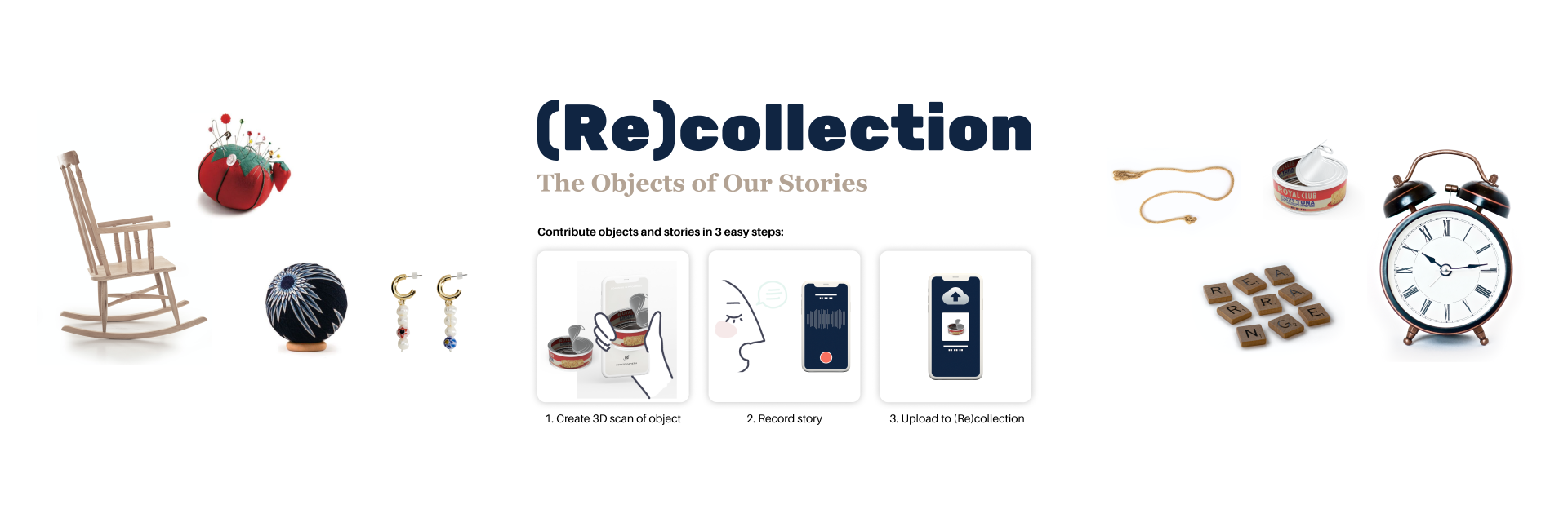
(Re)collection: a Digital Archive
The intent of this project was to develop a method of helping the bereaved move forward. Various frameworks exist to define the process of grief, but no process is truly the same. Sorting through the physical objects of one you've lost can be a difficult experience that brings back the various memories that continue to tie you to that person.
(Re)collection is a website and digital archive of objects scanned or donated by the bereaved. This archive serves to share and celebrate the memory of the everyday person and their everyday objects. First, an object is either scanned or sent in to create a 3D model of that object. This scan is accessible by the donator at anytime so that they have not fully lost that object. Second, the donator records a story about that object and the person they lost. Finally, the model and the story are uploaded to the archive to be shown and explored by others who may be going through the same difficult process.
AXO
Class: Sophomore Studio | Instructor: Herb Velazquez
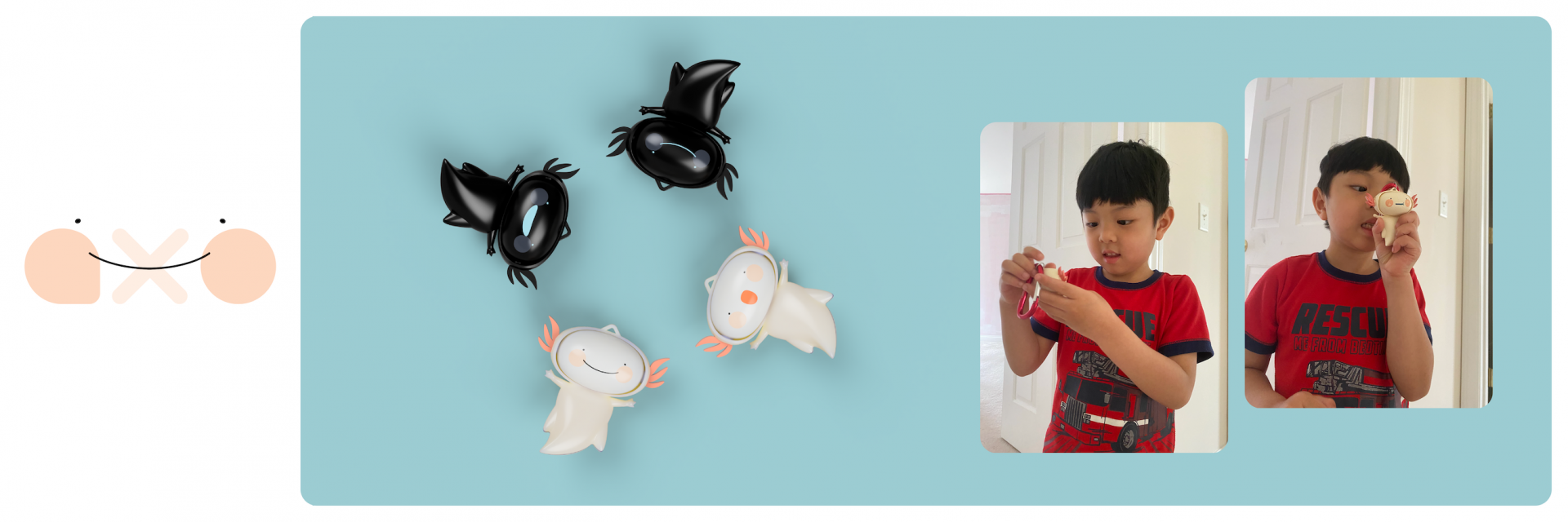
The intent of this project was to create a toy that was both fun and educational. AXO does both by providing children a way to learn about their emotions and help communicate how they feel no matter where they go.
When I began this project I wanted to create an interaction that a child could share with other people and keep to themselves. I went through concepts like a tilting ball maze with movable obstacles and a bubble wand set that had different animal features that you could switch up. The concept being that a child could play with their parents and try to imitate the sound of the animal as they hold the wand up to their face and blow the bubble. These initial ideas felt like they were lacking a significant learning experience so I tried to approach the toy from a different perspective, what if instead of simply a toy, it could become a tool? A way to communicate in this developmental stage of a child's life.
After talking to some children, mainly my own five year-old brother, I then came up AXO who takes the form of a naturally friendly axolotl. AXO has easily interchangeable faces that can be rotated to express a variety of emotions. It offers children a unique learning experience as they assemble AXO and gives them the tools to better express themselves. As a backpack charm, AXO can be taken anywhere from school to road trips.
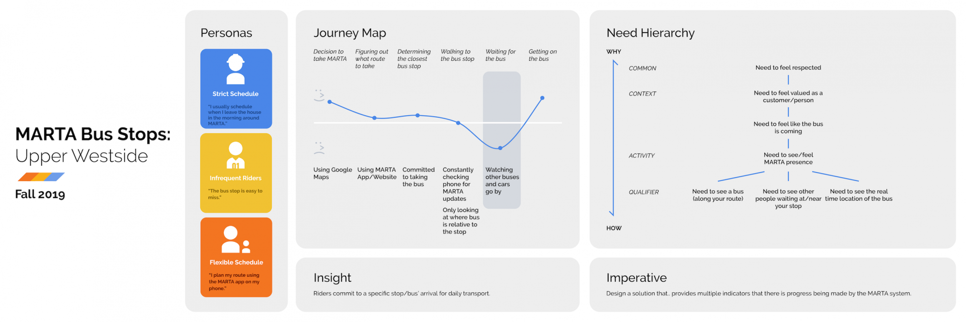
MARTA Bus Stops
Group Members: Morgan Abney, Mariam Marzouk, Camille Pettit, & Kyle Smith
This was a design research project completed in VIP: Design Bloc. The focus of this past year was the MARTA bus stops in the Upper Westside area of Atlanta, specifically the area in which the Upper Westside CID operates. The result of this project would be a final concept that would be presented to our partners, Upper Westside CID, Pillyr, and MARTA Army, which would then be built.
In the 2019 Fall semester, this project started with going out and observing the current state of the area's bus stops. Some of our observations were the information asymmetry, lack of infrastructure and support for riders, and the disparity between stops as some would be an entire shelter or simply a pole in the ground. After observing the area, we began interviewing riders a these stops.
Personas were then developed and used to create a journey map that singled out the step of "waiting for the bus" as the most negative point in a rider's journey. This then led to the insight that "riders commit to a specific stop/the bus' arrival for daily transport" which focused our need hierarchy chart. The main need we discovered was that riders need to feel like the bus is coming, which then broke down into various other factors that can be seen on the chart.
Ultimately, my group decided on the imperative that a solution should provide multiple indicators that there is progress being made by the MARTA system as this met the needs we found.
As an individual, I went out and interviewed riders, created the assets in the final presentation, and broke down the needs in our needs hierarchy. I learned a lot in this semester and am proud of the work I did alongside my group. I continued this course in the Spring 2020 semester to complete the project and develop a final concept.
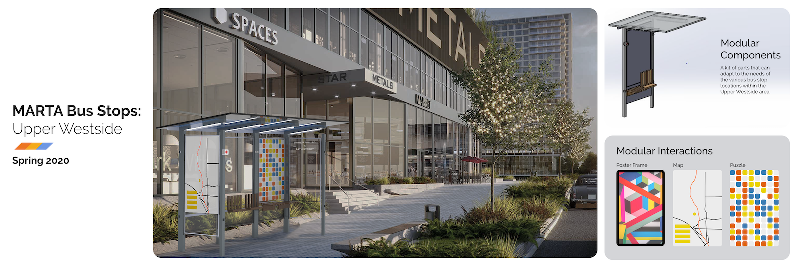
MARTA Bus Stops
Group Members: Chris Muse, Jake Park
In the 2020 Spring semester, the MARTA bus stop project continued by combining the work from the previous semester and focusing on an overarching need to increase visibility at stops.
The first design cycle resulted in stakeholder maps to determine who we would focus and value proposition maps evaluating the gains and pains at the current MARTA stops. We also defined our design criteria to meet the needs of the daily riders that we decided to focus on. As we started concept sketching, we continuously gathered feedback from community partners such as Upper Westside CID, Pillyr, and MARTA Army but also from people who actually used the stops.
In the second design cycle, we built off of that research and the various concepts we had and fleshed them out in our final groups. One of the concepts I thought could meet our design criteria was a modular bus stop. This bus stop would provide the basic needs of shelter and seating, but also provide customizable interactions from maps to puzzles. A modular bus stop would also allow each stop to adapt when there are limiting factors like narrow sidewalks and small footprints.
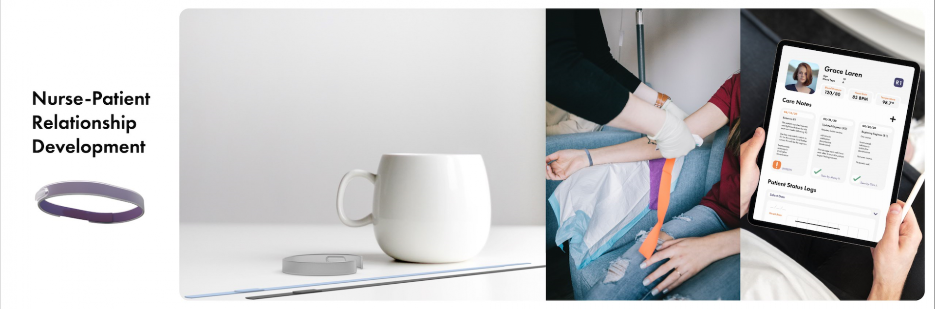
Wellness Product
Class: Sophomore Studio | Instructor: Herb Velazquez
The objective of this project was to "design a consumer wellness product for 2025 that appeals to college students and encourages usage to enhance human wellness/fitness".
This concept is for a bracelet two part that would help quickly develop the rapport between a nurse and a patient through an efficient exchange of information and a physical token of that relationship. The outer part would be given to the patient by the doctor and the inner part would be given by the nurse and be replaced after each visit. Every nurse would have a distinguishing colored bracelet so that over time, the patient would be left with a collection and memory of the nurses that helped them through their treatment.
The bracelet also features a magnetic chip that contains the patient information so that it can be easily scanned and accessed by nurses through an app.
The goal of this concept is to eliminate a barrier in communication between the nurse and their patient in order to provide the best treatment without adding stress or work onto either one of the parties.
More about this project can be found here: https://www.alysonlam.com/work/sp20-p2