NeoSeed
Class: Sophomore Studio | Instructor: Kimberly Snyder
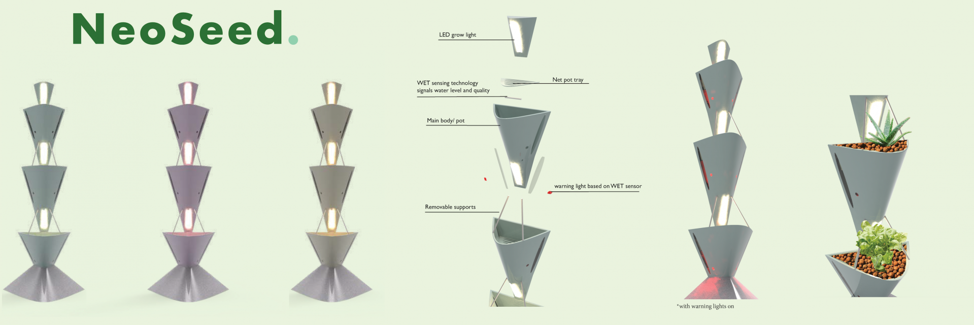
The task for this project was to come up with a “Wellness” product which would be use to improve the wellbeing of the user. For this we were instructed to target college students because it is a user group that we could directly identify with, interview, and uncover the major problems that most face. After extensive research on the many things causing stress, and unrest amongst college students across the nation I decided to tackle the problem of eating habits. I landed on finding a way to make growing food at home a more convenient activity for students despite their living arrangement or lack of space. Many students whether they live on or off-campus have limited space, lighting, and time to devote to an extensive garden. By creating a low maintenance, simplistic hydroponic grow system I could not only encourage healthier eating by having fresh ingredients readily available, but also bring life to these otherwise dull spaces via bringing green inside. NeoSeed uses the Kratky hydroponic method which requires no external pumps, and minimal watering while promoting fast growth, and a hearty harvest. This system is not only suitable for leafy greens and herbs but a plethora of plants from dainty flowers to hardy succulents. The goal of this product is to show young adults how easy it can be to grow your own food, promote healthier eating habits, and bolster mental health via the tranquility of botany.

Valdrome
Class: Sophomore Studio | Instructor: Kimberly Snyder
For this assignment we were simply asked to create a floor lamp, made out of metal, for a particular location of our choice. After some exploration into the different uses of lighting from outdoor pathfinding to intimate reading lamps I decided to come up with a solution for lighting a sunroom or patio setting. People tend to use these types of areas for small gatherings of the family or to get quality time outside without being totally exposed to the raw elements of nature. Due to my chosen areas proximity to the natural world I decided to make an attempt at originating an organic, soft looking design to juxtapose the rough industrial material we were required to use. I dug deep into form inspiration taking note of the highly detailed art nouveau lamps of the late 1800’s, 60’s psychedelic concert posters, and nature itself. In doing this I landed upon a quite outlandish form for a lamp of our day and age, that almost mirrors the curves you would see in a flourishing field outside. My intention was to remind users of the beauty, and importance of these natural forms every time they glance at the lamp. It is not meant to be a small corner room light but rather a statement piece that brings warm light and elegance to a space.
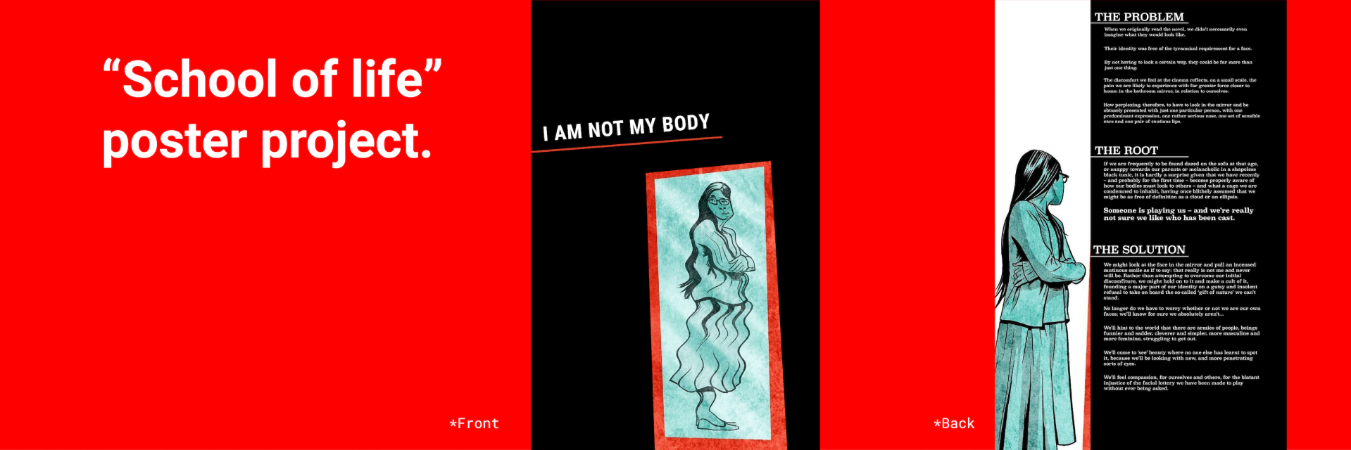
“I am not my body”
Class: Graphic Design | Instructor: Lisa Babb
The “School of Life” is a website consisting of small videos and articles with the intention to help “people to find perspective and resilience in the face of life’s challenges.” They cover a broad range of topics from relationships to self-knowledge and awareness. For this particular assignment we were to choose one of their articles to design a two-sided poster for. One side was to be somewhat of an advertisement to draw people in and the backside was to give insight into what the article discussed. With this being my first real graphic design production I was quite intimidated on how the entire process would go. I perused many of the articles on the website and started ideating on three of them that really caught my eye. After a few rounds of critique I decided to choose one called “I am not my body” and push forward with this idea. In summation the article discusses how one should not feel uncomfortable in their own skin and rather acknowledge that your body isn’t your identity. By transferring this message into visual communication I learned the importance of simplicity and directness. Any graphic design that does not put the message first and make it abundantly clear is ineffective. I also learned the many features such as layout, font, and color which all play a major role in delivering the message. In completing this I became further interested in graphic design and am excited to learn more.
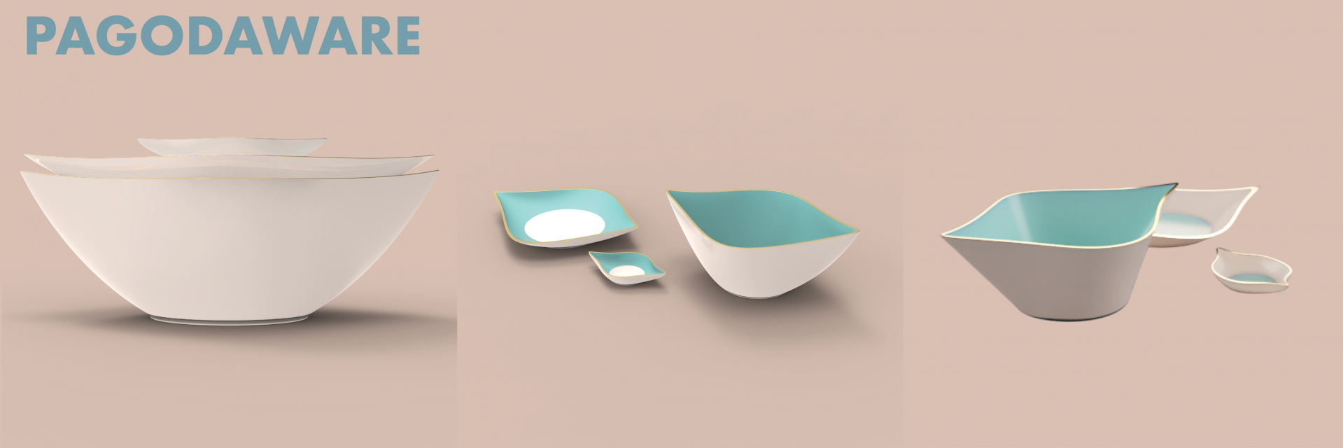
Pagoda
Class: Sophomore Studio | Instructor: Kimberly Snyder
For this project we were asked to create a 3 piece set of dinnerware based on a specific region, for me it was Vietnam. In order to accomplish this I started off with researching how and what the people of Vietnam tend to eat. I found that most meals take place in a personal family setting, where they usually sit on the floor with a table in the middle. In addition I found that most meals have a number of small dishes that get passed, multiple sauces, and a main rice or soup bowl that each person has. Notably chopsticks are the most common utensil so they hold the bowls close to their mouths and scoop the food out. Based on these discoveries I decided for my criteria to be easily passed plates and bowls, with tapered edges to easily scoop rice with chopsticks. For aesthetic, and contour inspiration I explored the shape of pagoda temples commonly found in urban areas of Vietnam. From this I ended up with a cohesive set including a plate, bowl, and sauce tray that facilitates the intake of common Vietnamese cuisine while mirroring traditional architecture.
