
CURA
Class: ID 3032 | Instructor: Samuel Harris
See full project here:
behance.net/ethanharrington
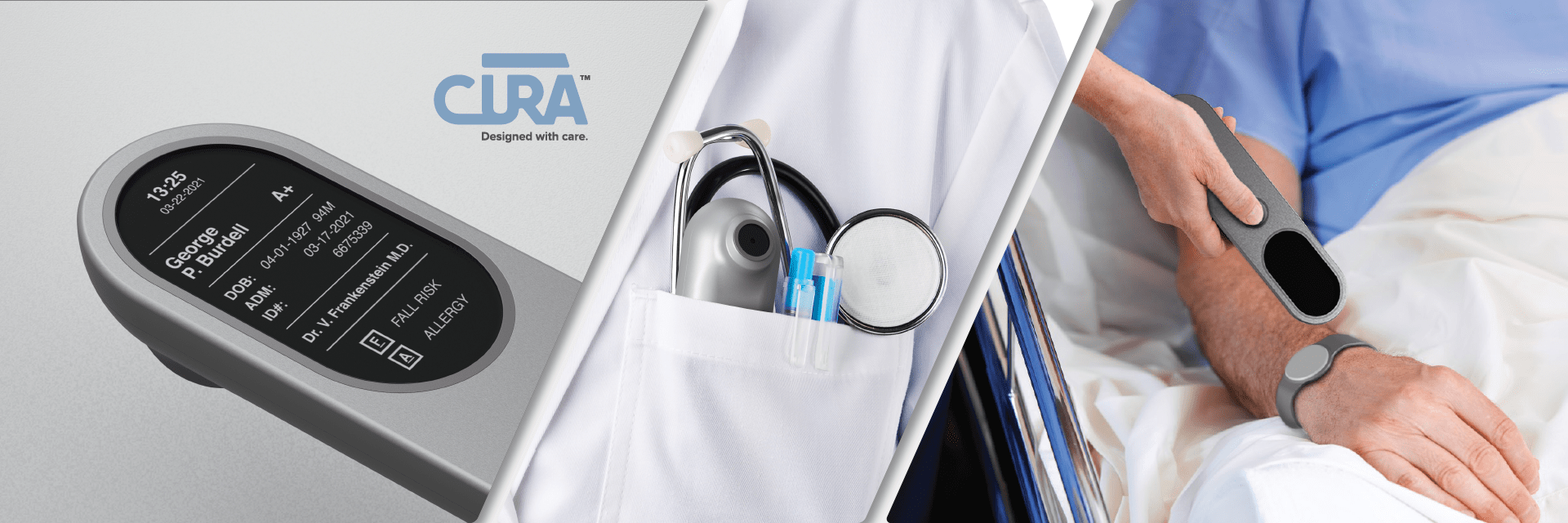
Health Studio II project focused on redesigning hospital implemented patient identification system.
CURA is a patient identification Scanner & Tag system that aims to redesign and replace the current system of plastic wristband & barcode identification. User research was conducted that included interviews with medical staff. The new design increases efficiency in allowing faster ID scans that in turn allows medical staff to spend more time attending to patient care. The system reinvents the way patient identification information is visualized to the attending physician and aims to increase patient safety by reducing the chances of medical errors that could result in patient harm or undue medical expenses. And the system preserves data security through the use of passive/active RFID technology that is research proven to not cause instrumental interference (MRI, X-Ray, CT scan safe) and includes a transmission error rate of the one millionth order making it 99% reliable.
Using RFID technology, the redesigned system allows for the identification of patients in scenarios that were previously not possible. Previous systems required a direct line of sight to the patient’s wristband and often required physical contact with a patient. Identification is now improved in situations where a patient was unresponsive or in distress, where a scan can be taken when the tag is obstructed. The scanner is now portable and allows for the identification of wondering patients.
Brand Language Project
Teammate:
Lauren Duderstadt
Class: ID 3041 | Instructor: Samuel Harris
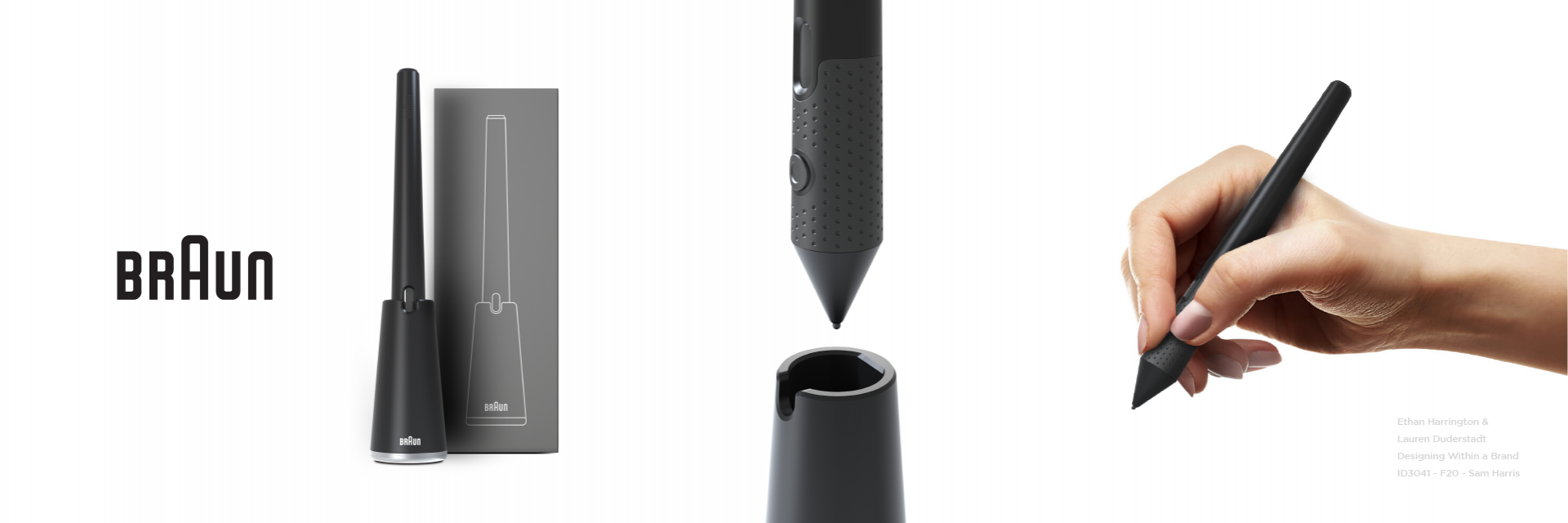
If Braun's defining brand language, core values, product attributes, design principles, and signature elements were applied to an electronic stylus, what might the result be?
This project challenged students to design within the framework of an existing brand to create a writing device of our choosing. Working in a team of two, the resulting stylus design aimed to maximize product function and choreographed user interaction between both the stylus itself and the corresponding stand. The hope was to create a balanced entity that acted as a singular unit when the stylus was docked, and then elegantly separated into two individual forms when the stylus was removed. By doing so, we were considering the overall interaction of the product within the home – we believed, as does Braun, that the function of the product when in use it just as important as the function of the product when at rest. The design features a keyed form that ensures the user returns the stylus to the stand in the correct orientation (charge indicator facing forward), programable button, textured grip, tapered body, and both primary and secondary logo placements relative to the stand and stylus. Surface level packaging was further developed to better show the integration of the product within the brand.
See full project here:
behance.net/ethanharrington
behance.net/lduderstadt
Node
Class: ID 3041 | Instructor: Samuel Harris
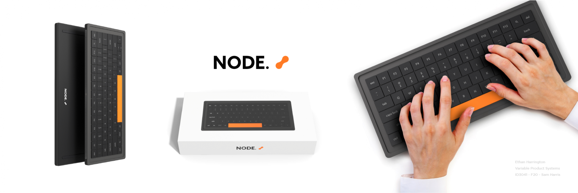
Designing a system of products is a key skill for any designer. It is important to understand the role that any individual element plays within the larger system, what characteristics, forms, components, colors, etc. are shared between individual elements, and in what way that system emphasizes interaction to ultimately strengthen the rational of the overall brand.
Node is a modular, expandable keyboard that aims to address a wide-ranging variety of user needs specific to the home-office/desktop space. Node creates a familial system of products centered around interaction with the main keyboard where external elements branch off the sides of the keyboard in differing configurations. By doing so, previously disjoined products commonly found on the surface of the desktop now become connected.
Utilizing the design strategy of biomimicry, Node was developed around the data structure principle of a “binary tree” found in computer science (see Behance project page below for visual clarification). The central keyboard acts as the root node in the system and connecting nodes act as branching child elements that build from the root. The system is ultimately limited by the availability of expandable components (those included in the base design are speaker, USB tray, and number-pad) and the physical space available on the desktop.
See full project here:
www.behance.net/ethanharrington
Momo Car Project
Class: ID 3041 | Instructor: Samuel Harris
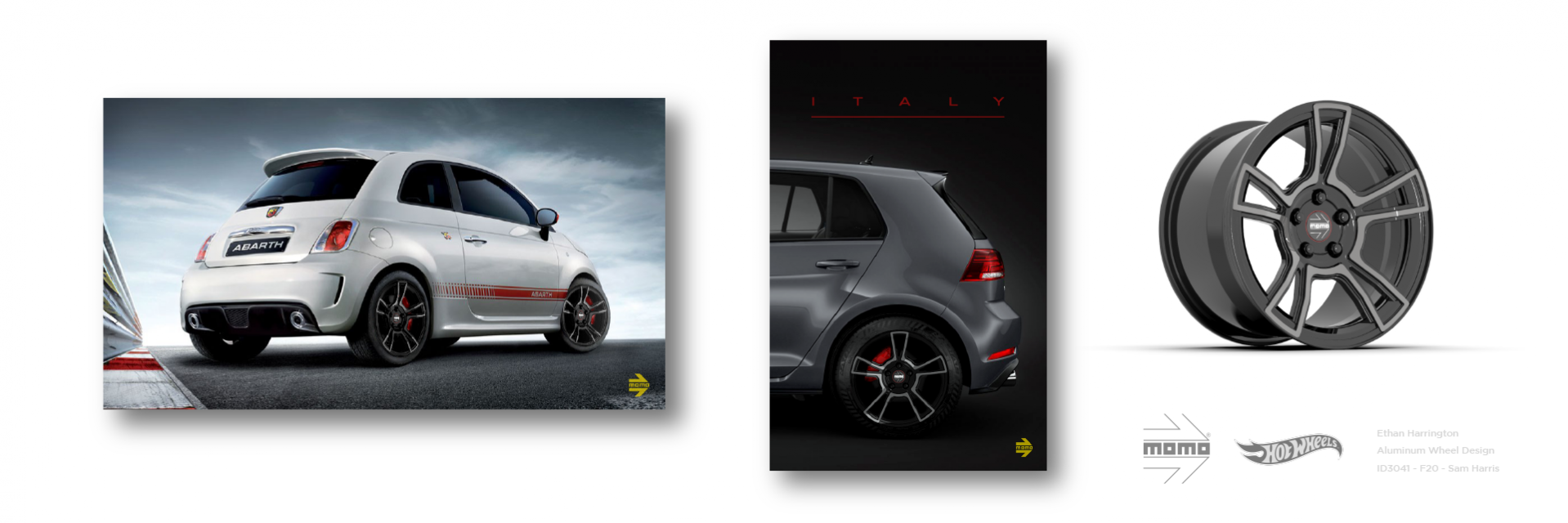
Designing for manufacturability is essential in creating products that can be feasibility brought to life given material, mechanical, and economic limitations. When designing for a client, communicating one’s expertise in considerations for the finest of manufacturing details not only helps to sell the overall idea, but strengthens the clients trust in the designer and the work therein produced.
The Italian wheel brand, Momo, partnered with Hot Wheels and Georgia Tech, challenged students to design a manufacturable aluminum wheel to seamlessly fit within the Momo brand lineup. I designed within a target vehicle range of sub-compact (U.S.A.)/B-segment (Europe)/Supermini (U.K.) vehicles to allow for a more refined design process that aimed to incorporate visual elements of both the brand and the associated vehicle bodies. This also ensured that the wheel design could be easily projected to a target user within a target market, further strengthening trust in the marketability/profitability of the design. The result was an 18-20 inch, split 5-spoke wheel with a grey, tinted clear machine face finish, large windows to highlight vehicle brake disc sets, a recessed lug pattern, and a full-surface front face expanded to the rim. The design aimed to maintain the modesty and simplicity of both color and form often seen in the target vehicles, avoid being ostentatious while still creating a sense of sophistication, professionalism, and excitement, and blend well with the Momo brand/existing products. The final design was later projected to a Hot Wheels scale (see Behance).
See full project here:
www.behance.net/ethanharrington
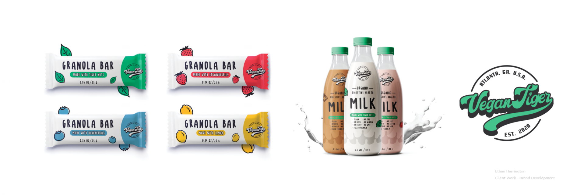
Vegan Tiger Packaging
Solo project
Packaging design, logo design, and brand development – Client initiated project for startup digestive heath food brand, Vegan Tiger. The brand sells products made from tiger nuts (a type of root). The client was presented with the above packaging concepts that helped to further define a visual language for the brand and distinguish their products from other products on the market.
See full project here:
www.behance.net/ethanharrington